Intro Intro

A collection of artistic pieces that I like...some (may be) produced by

me. I am studying Graphic Design at Milton Keynes College so

anything I deem worthy enough will be included. Hope you enjoy and

contribute comments as, anything constructive will be greatly

appreciated. (ooo a widow)

Thursday 3 June 2010

Magazine


An example of a spread from my magazine: layout/structure -me...writing(not quote) -me...advert -not me


(magazine is a limited edition print of 40)

Home made font


some letters are a little "off" but to keep some consistancy mean letters came out badly

My magazine's advertisment


before censor...


...after, in someways I prefer this, as it draws attention in more - also notice the subtle censoring (most words can still be read with a bit of imagination)


Website banner/logo


Did this for a friend...last time I checked the site was not up and running

Life drawing 3

Life drawing 2

Life drawing 1


hands

Rationale sent with "spa" competition entry

Rationale...


My thoughts:


My aim was to produce a brand targeted towards an already established market/demographic...i.e. mature women. This could be seen as an easy choice, however, it is harder to break into as most women already have a preferred brand. Selling this product range is about breaking their patterns and changing choices.


To do this I thought I would accentuate the quality by producing a elegant, natural range. Every aspect is targeted for this, the swan, the ‘hand stamp’ logo, the casing and bottle...and therefore, the product. To do this means the product could present itself as either an expensive gift or a daily use product (considering the amount some women are willing to spend to get the best product)


The overall design is not all that creative or daring, but I am not intending to isolate or dare people to buy my range. I want the customers to feel confident buying this, to trust it.
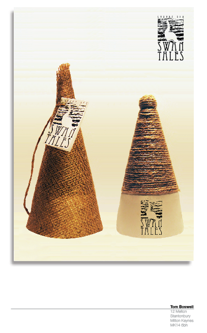

Name:


“Swan Tales” is meant to insinuate the tales of the beautiful. The fact that it was for a luxury spa, aswell as a product range, meant that I had to produce a name applicable for both. The “Tales” from the spa trip and/or the trips the product started.


Logo:


The logo was designed with the idea of a stamp in mind, giving it a hand-made, natural, textured finish with the purity of the swan coming out through this in negative space. A mono-tone pallet was used to give a natural feel, with no dye’s or chemical colours being used (aswell as the usual: photocopying/faxing etc).


Packaging:


Case:-


I decided to put my range into a case, all be it made up with material. This is to give an element of subtlety to the packaging whilst stimulating curiosity and surprise. It also shows that extra consideration has been placed into the product aswell as continuing to be ethical.


Bottle:-


This is the core of the design. The part left over and viewed, so it has to be nice. I chose two contrasting textures with the bottle. The lid is string coiled around, linking in the casing whilst the base has a silky satin texture. These contrasting textures offer another dimension to the product, making you experience it before even using it. In certain instances (e.g. for a facial scrub) it acts subliminally, as you take away the rough texture, you are left with the soft still in you hand.


Future developments:


There is the prospect of producing a range targeted towards the younger audience... “signet tales”. This is where the packaging can be made more vibrant, using the colour pallet of orange, white, black and more exotic textures can be brought into it.

Competition entry


This was for a competition brief...basically to name/brand/package a new luxury spa range

Alban hill nursery


yes...it is for someone else...it also required a greater amount of info on, though I did cut it down as much as i could

Another ucmk advert


an iconic image being used for an average advert

Diversity for MKCollege


Maybe a bit too provacative...though it was intended to empower victims

communication 2


communication before and after words with no words

collaberation


We were told to create an advert for the play production Chicago, after an hour of working, this is what Lisa Sampson and I produced

communication 1


Art piece with the annotation "communication"


Advert I did for an art exhibition

Thursday 11 June 2009

Be More Extrovert


This is from my "If I Could...I Would Be..." design brief. I chose the title "...be more extrovert" and i feel my picture is a minimalist interpretation of my title. It is meant to represent the inner sanctum and ones' personal space. The less extrovert (smaller one) is showing a "smaller" circle, but who still needs a similar amount of personal space as a bigger personality. Also the distance apart and crossing over is representative of this.

Royal National Institute for the Blind


This is my poster for the blind, well to inform people about the blind...I have pt it in situ. to see how much impact it has. I chose quite a good bus stop because it has lots of arrows over it, directing the eye towards the piece. The actual design, I think, was quite a complete design, clear, good fact, corporate colours, clear message etc, but after sending it to the RNIB (the company I did it for) they said they didn't like it...for all the reasons I liked it!!!


My girlfriend...the hag...or I should say, as a hag!! I got my girlfriend to pose as an evil witch from the book Fablehaven, took a photo and then drew it. My drawing skills leave nothing to desire...hence one of the reasons why I darkened the image (as well as to give a sinister aspect to it...) but it still is one of the only drawings I feel I can publish.

Student of the year


Not me!!, But my design got chosen as the ceromony's design and style. I'm really pleased with the glowing effect of the light bulb, it look quite realistic. Also I think the colour I chose for the writing (gold) was really good as it had a shinny sheen on it. The title fading out over the bulb could of been done better as the colours become a bit green instead of yellow/gold.

Thursday 26 March 2009

Page layout


You don't have to read this...it's just me practicing my page layout skills...quite well may I add. It was for a Andy Warhol magazine spread and I think the outcome is very sophisticated and professional. I like the magenta text injecting light and flare into the largely black and white page. The use of white space helps it's formality. The page was split into 3 columns with 2 being used as one...anyway, I like it.

Logos


Here are a couple of examples of logos I've created...all for real companies, but none chosen. All part of the uni course...which presents us with the opportunities of live briefs, which is great, and helps us develop our portfolio and helps us work with real clients.

Tony...I'm going to make you famous


One of my first attempts at working on Illustrator...back in the day...did it to produce a stencil, you know, so I could work banksy style, plastering good old Tony's face everywhere...anyway my plague of Tony Blairs' across Milton Keynes never came to fruition

My album cover


Reprezenting the crew... This is an album cover I was asked to design...playing on the fact of, if drawn and painted it can be as explicit as you want, no censoring, and brought for millions (check out Jenny Saville...(mmm, yum)) anyway, porn on the other hand, has age restrictions censoring general condemnation and is usually viewed by oneself. So what if you highlight the "private" areas in art...is it porn, or art. I consider mine as neither...

Wednesday 25 March 2009

More websites for the websurfer...


The music...


...the most important factor to viewing any art...this is a beautiful tack, but has no video, a real shame, High Contrast, the creator produces some very good other tracks...check them out.